When I first created this blog, it was my intention to work on my own wordpress themes and release them on this site. However, with so many other opportunities and activities I have online, I couldn’t find the time to start working on a wordpress design. Now we are nine months later, a new year has arrived, and one of my resolutions was to bring new life into some of my neglected websites.
At the moment I find myself almost finished with my very first wordpress theme. This one is not going to be released, as I intend to use it on my own weblog when it’s done, and keep it unique. My 2nd wordpress theme will be released though, and it’s going to be a clean, lite Web2.0 theme.
In the meantime I wanted to share with you some of the themes from other designers that I found when searching for Web2.0 themes. I noticed that many people frequently use the term web2.0 to describe their designs, however, most of them don’t actually have much 2.0 style to be named as such.
Some of the themes that I found to be Web 2.0 Worthy are listed below. These five pretty wordpress themes all feature their own unique characteristics with detail for web 2.0 graphic design elements.
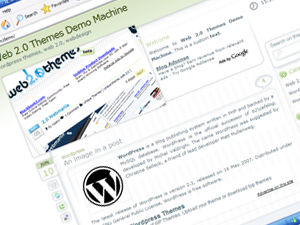
This first theme is called Sodelicious and was created by Rui Castro of web2themes.com. It has a web 2.0 style design with 3 nice features; a Slideshow screen on the left where you can place an animation or featured content, a big sidebar on the right that includes 3 widget sidebars, and 4 social bookmarks buttons that are automatically placed in your posts.
The 2nd theme, made by Aditi Tuteja, was named Curved because of the nice rounded blue corners. This theme supports widgets, and has a nice striped header along with tabbed navigation.
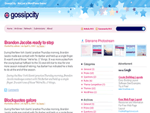
Gossip City is a web2.0 wordpress theme, created by DesignDisease, and is the perfect theme for your gossip and celebrity weblogs. It has a stylish 3-column, widget ready with sweet color palette theme, and was released under the Creative Commons Attribution-Share Alike 3.0 License.
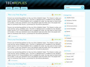
The next theme comes from Ndesign Studio and has a High-tech, glossy Mac style with web 2.0 mini icons. Validated XHTML and CSS, Web 2.0 colors, the perfect WordPress theme for your technology-related blog.
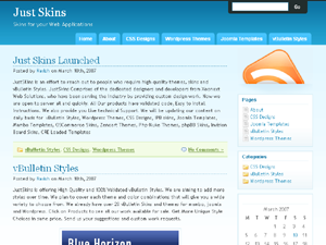
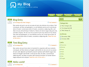
And finally the last theme is the rather simple looking Webby Blue Design from Justskins.com. This is a 2-column, widgets ready Web2.0 style wordpress theme, with light blue colors. Theme was tested with WordPress 2.2.x.
I hope that this post was useful to you. Make sure to visit this site again anytime next month, hopefully I have released my own 2.0 theme by then.
web 2.0 revolution
-Thanks for brining us these cool web2.0 themes. I have been searching long for a modern 2.0 design for my wordpress weblog for a long time, and I’ve tried tons of them but couldn’t find the right one. Now I’ve decided to go for the sodelicious theme. Definitely the best web 2.0 theme I have found so far. thanks again
webfound 2.0
-Nice! I like the glossyblue theme from Ndesign, have been using it on one of my blogs for over a year.
Think I’m going to try Webby Blue now. I like just like those light blue themes ;D
Still don’t understand why they call it web 2.0 themes though… All I know, is they’re sweet! lol
Imelda Bennings
-Once writing or recording a great blog post the subsequent step is to promote it using social bookmarking. These accounts embrace digg, propeller, furl, bebo, delicious and tumblr, among many others. The matter is finding time to bookmark your content across dozens of accounts. Fortunately, services like Onlywire can automate social bookmarking to dozens of the leading websites, and as well as plugins or buttons on your WordPress blog will facilitate blog syndication.